
If you know someone who uses the budgeting app You Need a Budget (YNAB), chances are you’ve heard them mention it. YNAB users are like vegans and runners—they love to talk about it. It’s understandable, too. YNAB can be just the kick in the pants you need to get your finances in order with a budget.
Despite all its strengths and rave reviews, YNAB does have a weakness that could be a dealbreaker for some users if there weren’t an available solution. YNAB’s Achilles heel is its limited reporting functionality. Fortunately, you can install the Toolkit for YNAB browser extension to gain access to several additional ways to slice and dice your financial data.

The Toolkit for YNAB Extension
Toolkit for YNAB is a free, open-source browser extension that adds features to your YNAB dashboard and allows for greater customization. Extensions are available for Chrome and Firefox and give you views of your financial data that YNAB doesn’t otherwise offer. We’ll look at the reports that come with the YNAB Toolkit to highlight the extra insights you can get by installing it.
The YNAB Toolkit Reports
Without the Toolkit, YNAB natively provides three reports: Spending, Net Worth, and Income v Expense. By contrast, the YNAB Toolkit includes seven reports:
- Net Worth
- Inflow/Outflow
- Spending By Category
- Spending By Payee
- Income vs. Expense
- Income Breakdown
- Balance Over Time
For any report—from YNAB or the Toolkit for YNAB—you can specify the time frame and choose to include or exclude specific categories and/or accounts.
Once you install the Toolkit, view your new reports by selecting Toolkit Reports in the main YNAB menu.
Net Worth Reports: YNAB vs. the Toolkit
The Toolkit’s Net Worth report is very similar to YNAB’s, with a few extra features thrown in. We’ve removed some detail from our screenshots, but don’t worry; you’ll see exact numbers when viewing your reports. First, let’s look at YNAB’s native Net Worth report.
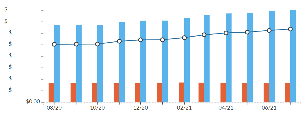
Compare that to the Toolkit’s Net Worth report.

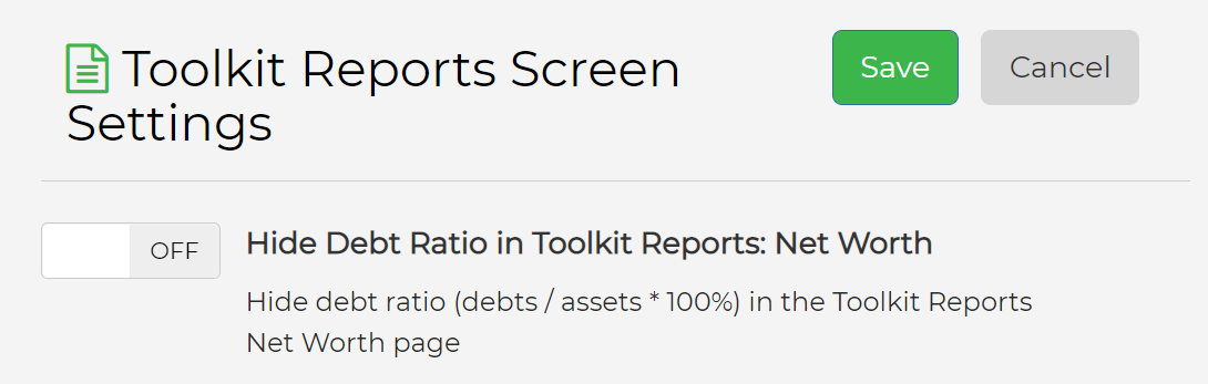
Both reports display a bar graph showing debts in red, assets in blue, and your net worth as a line. In addition, the Toolkit’s Net Worth report gives you the option to Flip Debt so that your debts appear below the $0.00 mark in the graph instead of stacked up against your assets. The Toolkit report also includes your percentage debt ratio, a feature you can toggle on or off in the Toolkit’s settings page.
The YNAB Toolkit’s Inflow/Outflow Report
Are you bringing in more than you’re spending?
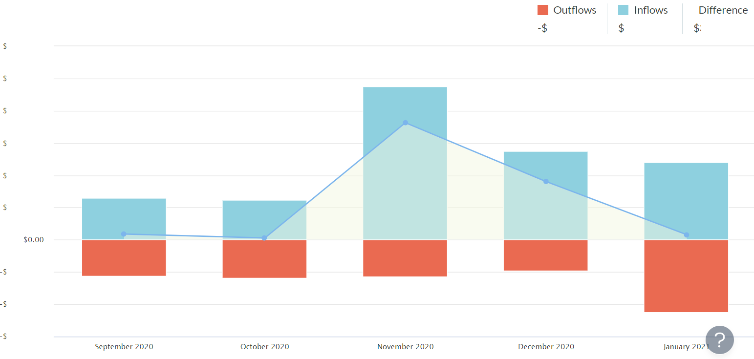
To view the Inflow/Outflow Report, you’ll need to install the Toolkit since YNAB doesn’t include this report otherwise.
Spending Reports: YNAB vs. the Toolkit
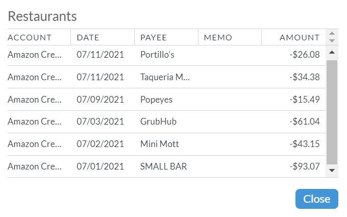
YNAB’s basic Spending Report shows you how you spent your money over time. And also, what kinds of things are you spending your money on? (Psst: the answer is “restaurants.”)
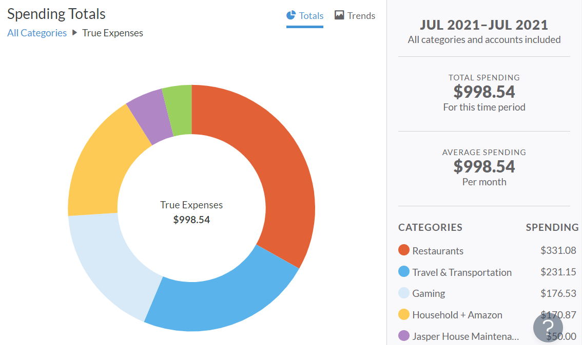
Drill down into the pie chart through your hierarchy of categories to see the individual transactions from that category. (Note to self: You know you can cook at home, right?)
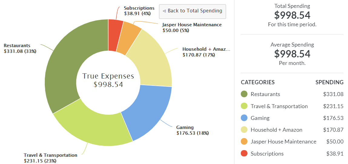
Installing the Toolkit extension will give you access to two new reports about your spending, Spending by Category and Spending By Payee.
The Spending By Category report is similar to YNAB’s Spending Report with some extra labels. You can click into any category to view a list of transactions.
YNAB Toolkit’s Spending By Payee report will show you who, exactly, is getting your hard-earned money. (Costco. Always Costco.)
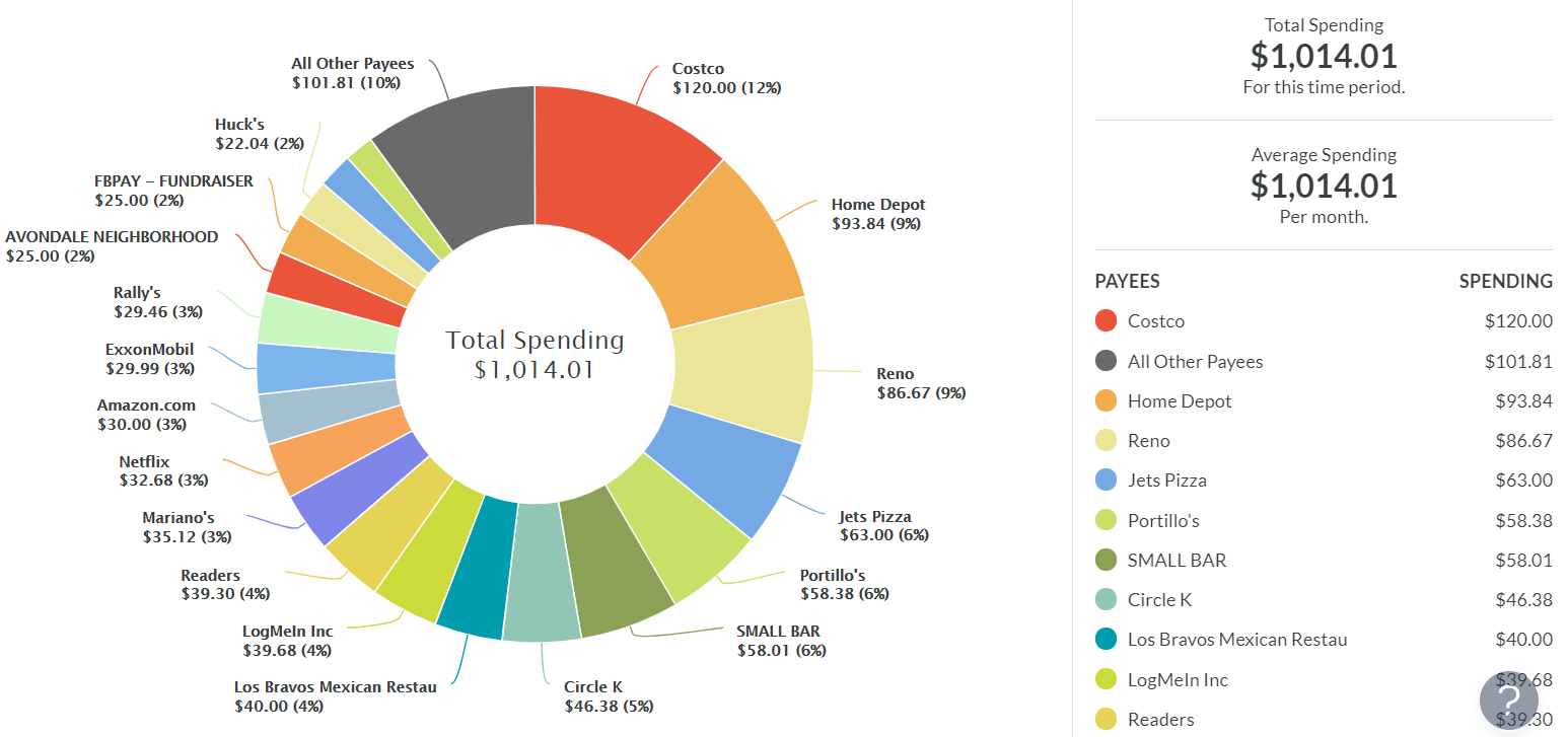
As usual, you can click on the pie chart to see a list of individual transactions.
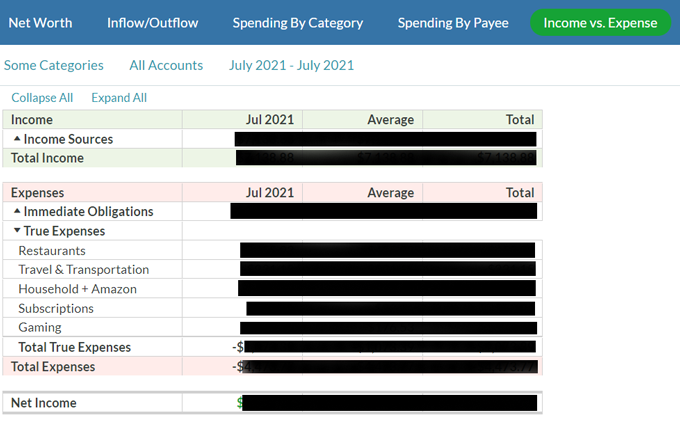
Income vs. Expense Reports
Both the stock YNAB Income vs. Expense report and the one from the Toolkit show you a table of transactions for the time period, categories, and accounts you choose. The only difference between the two reports is that the Toolkit’s Income v Expense report looks a little nicer. Here’s the report from YNAB:

As you would expect, you can view individual transactions by selecting the dropdown arrows to the right of your category names.
The Toolkit’s Income vs. Expense report contains the same information, just formatted a little differently.
You can decide which version you like better.
Two Extra Reports from the Toolkit for YNAB
The last two reports are only available if you have the Toolkit browser extension installed.
The Income Breakdown Report
The Income Breakdown report displays a Sankey diagram of your sources of income and where those dollars are going.

There’s a lot to play with in this report. It’s handy for people who save money to a tracking account.
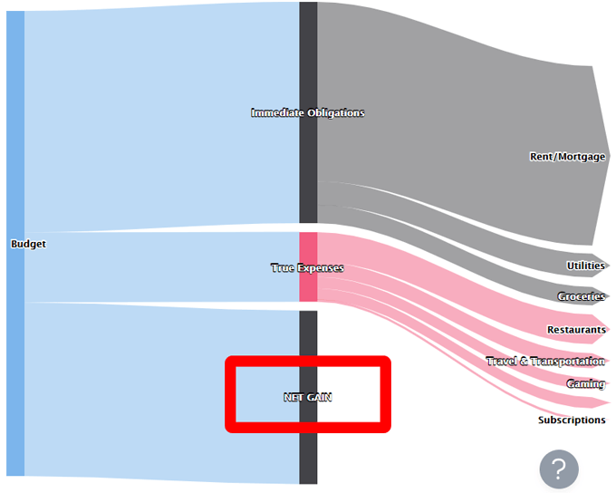
In YNAB, tracking accounts are off-budget, so those transactions don’t appear in any budget categories. Nor do those transactions occur in other reports. That’s where the Income Breakdown report comes in. It will show the money you move to tracking accounts as a Net Gain, giving you an idea of how much off-budget money you’ve saved.
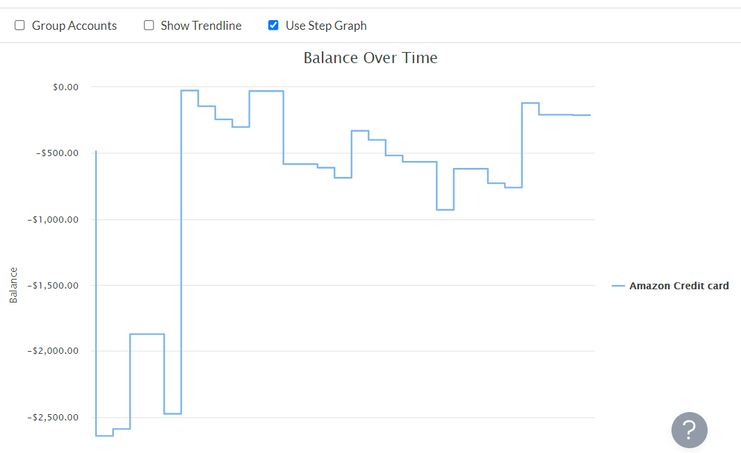
Balance Over Time Report
The last report from the Toolkit for YNAB is the Balance Over Time report. This report displays the balances of individual accounts over the period you select. This report can show information from one account (like the screencap below) or multiple accounts.
YNAB Toolkit Report Screen Settings
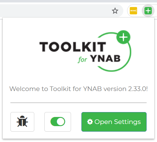
In the Toolkit for YNAB extension’s Settings page, you can make a few more tweaks to the way reports look. Access these settings via the browser extension.
Select the Open Settings button to launch a page with all the Toolkit options. Select Reports Screen for three ways to configure YNAB’s native reports.
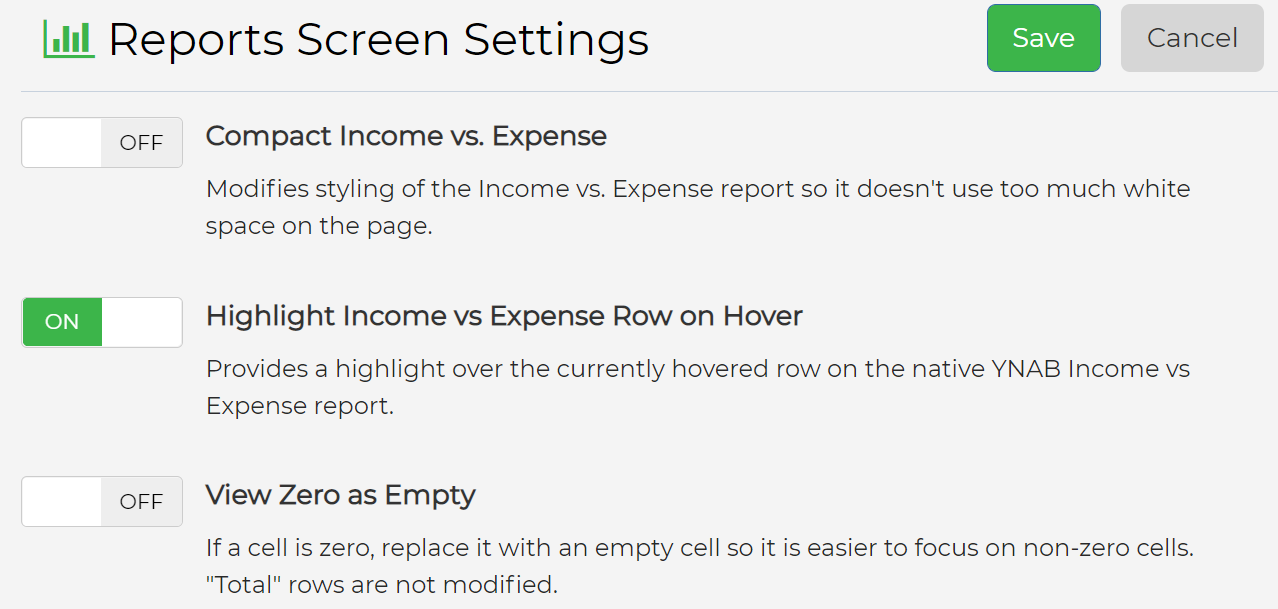
Select Toolkit Reports to toggle the debt ratio on or off in the Toolkit’s Net Worth report.
Use Your Data to Make Informed Decisions
The reports included with YNAB and the Toolkit for YNAB help you make informed financial decisions. Use them wisely, and your financial outlook is sure to improve.
source https://www.online-tech-tips.com/software-reviews/ynab-toolkit-reports-what-you-should-know/